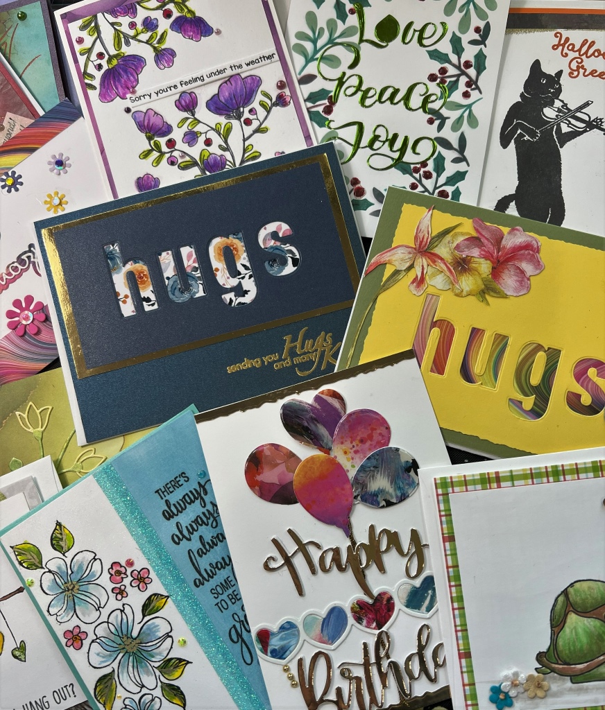
The elegant butterfly is Woodware Butterfly Sketch and stamped using Versamark embossing ink, then dusted with gold embossing powder, and heat set.
The background is shaded card stock cut a little smaller than the A2 card which it’s glued onto.
A sentiment is stamped onto white card stock, cut out, then shaded with blush colored dye ink. Gray flat back pearls were glued randomly on the card front.
I have various cards that are hardly as good as I would like. This butterfly image is gorgeous, but none of my cards with it came out as pictured in my head. I actually picture (in my head) a solid white card with the butterfly embossed in gold or another color. Super simple, but I think that would bring more justice to the beautiful butterfly.
Why show them? I feel people can look at card sites and think “no use trying–mine will never be perfect.”
We can learn from other’s mistakes. Hopefully, others can learn from my mistakes, too!
Maybe I should have used silver embossing powder since there is gray in the background? If I remember right, I tried white embossing powder, but it didn’t show up. Maybe this background has too much going on for a stamped image?
Maybe I shouldn’t have shaded the white cardstock sentiment? It seems like the shading makes it muddy looking.